
I thought I should read it, but I’ll be honest: I wasn’t really looking forward to it. I am a software developer by training, and I don’t always find process and organizational questions that enjoyable. Moreover, the book, with its complex-looking diagrams on the cover, looked rather dry and theoretical. Therefore, I was thoroughly surprised when I found that the book was an absolute pleasure to read. It was interesting, almost exciting, and, above all: Very insightful. Below, I will give a brief overview of what I learnt from this book.
The number one customer question
“When will it be done?” is the question that Vacanti starts the book with. This is the first and most important question that customers ask once any (software) project is started. In order to answer this question with reasonable confidence, you have to have a predictable development process - note the “Predictability” in the book title.
The author goes on to introduce the concept of flow (work items should not get stuck or abandoned), along with three fundamental flow metrics: Work in progress (WIP), cycle time, and throughput. We learn the relationship between the three, and why they are “actionable” (again: see book title): When these metrics go awry, they suggest concrete interventions or investigations.
Five almighty assumptions
We learn about Little’s Law, which says that if you change one of the three fundamental flow metrics, you will affect at least one of the other two, as well. For example, if you increase WIP, your cycle time is very likely to go up, and even your throughput might suffer.
Maybe even more important than the law itself are the assumptions that come with it. These assumptions are:
- The average input or arrival rate […] should equal the average output or departure rate (=throughput).
- All work that is started will eventually be completed and exit the system.
- The amount of WIP should be roughly the same at the beginning and at the end of the time interval chosen for the calculation.
- The average age of the WIP is neither increasing nor decreasing.
- Cycle time, WIP, and throughput must all be measured using consistent units.
The more our process violates one or more of these assumptions, the less predictability we will have, says Vacanti.
Diagrams
Certain violations of Little’s Law’s assumptions will be visible in cumulative flow diagrams (CFDs) or cycle time scatterplots, which are introduced next. They may look a little intimidating at first, but they are constructed according to simple rules, while conveying loads of information.
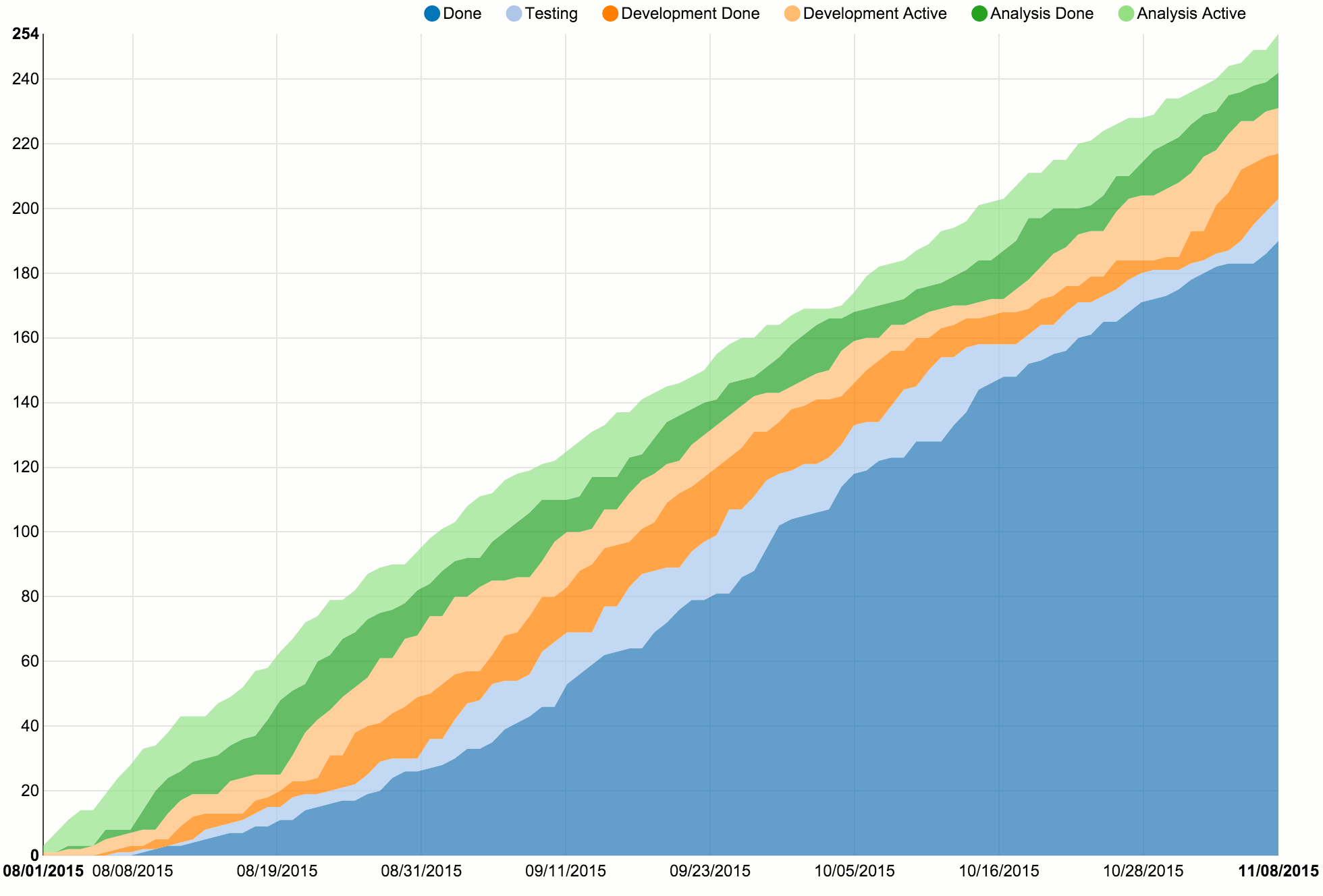
The x axis of a CFD shows time, while the y axis shows work item count. The coloured bands represent the different workflow states in our process. Work items arrive at the process “from above”, and leave it “through the bottom”, which is when they become part of the dark blue “Done” area. The wider a band is, the more work items are in the corresponding process state at the same time.
This gives great visibility into queues and delays. If a band like “Analysis Done” or “Development Done” becomes wider and wider, you know that work items are just lying around and delivery is most likely being delayed. You should investigate, and possibly reduce your work in progress.
The author emphasizes repeatedly that CFDs are only for looking back, not looking ahead. This means that you should not use them for any kind of estimation or prediction. That’s where the second type of diagram, the cycle time scatterplot, comes in.
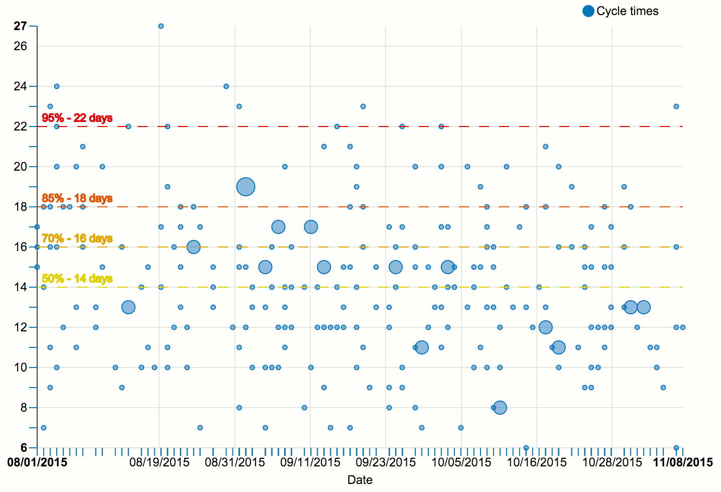
Like the CFD, the cycle time scatterplot is constructed according to simple rules. On the horizontal axis, it shows time, just like a CFD. On the vertical axis, it plots the cycle time of finished work items. Each dot represents one finished work item. For example, if an item completes on September 1st after spending 15 days in the process, we go to September 1st on the horizontal axis, and up from there until we reach 15. There, we draw a dot. Larger dots mean that multiple work items finished on the same day with the same cycle time.
The actual use of such a scatterplot comes from the percentile lines that we add (the horizontal yellow, orange, and red lines in the diagram above). We can use any set of percentiles we like, so let us choose 50%, 70%, 85%, and 95% for now. A 70% line at 16 days means that 70% of the displayed work items were finished in 16 days or less, while the remaining 30% of work items took longer than 16 days to complete.
We can use these numbers when making commitments to our customers: “We will finish this work item in 16 days or less with a 70% probability of success.” Maybe, however, the customer does not feel at ease with 70% probability. Not a problem. We can give an 85% probability commitment, but we will have to raise the time range to 18 days.
Just-in-time prioritization and commitment
Speaking of commitment: Vacanti dedicates an entire chapter to prioritization and commitment. First, he demands that our process should have a Ready column with the following properties:
- It is the one and only point where work items can arrive at our process.
- It has a WIP limit, so that it can act as a throttle by which we can constrain the amount of work entering the process.
When there is capacity to pull new items into the Ready column, there will be a prioritization decision:
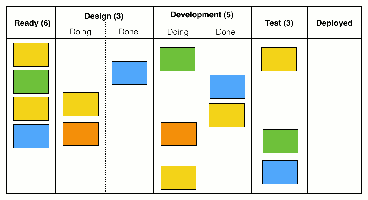
In the depicted situation, the WIP limit is six, but there are only four items present in the Ready column, which gives us a capacity of two. Therefore, we ask our customer: “What are the next two most important items that we should start at this time?”
Note how different this is from traditional methods, especially Scrum. We do not sort and groom an entire backlog of items. We do not ask for the next ten items. We do not ask for the next five items. We ask for the next two. Every prioritization beyond that is unnecessary and wasteful, because we do not have capacity to take on more. In fact, Vacanti finds very clear words on maintaining a backlog:
“The truth is that the effort spent to maintain a backlog is waste. It is waste because […] much of what goes into a backlog will never get worked on anyway. Why spend time prioritizing items that you have no clue nor confidence if or when they will ever get worked? Worse, when you are ready to start new work, new requirements will have shown up, or you will have gained new information, or both, which will require a whole reprioritization effort and will have rendered the previous prioritization activities moot.”
The moment you pull a work item into the Ready column is also the point of commitment. Commitment happens at the item level, and comprises two things:
- Once the work item is started, the expectation is that it will flow all the way through the process until completion.
- We communicate to our customer a cycle time range along with a probability, as already explained above (“18 days or less with 85% probability of success”). The respective numbers are gained from a cycle time scatterplot.
Less estimation
You might be wondering why, in this summary, I make no mention of story points, t-shirt sizes, or other differences in work item size. The reason is that the presented methods do not require any such estimation. For one, this is because we are dealing with averages over time, so the size of each individual work item does not matter that much. But there is another point:
“[…] more importantly, the variability in work item size is probably not the variability that is killing your predictability. Your bigger predictability problems are usually too much WIP, the frequency with which you violate Little’s Law’s assumptions, etc. Generally those are easier problems to fix than trying to arbitrarily make all work items the same size.”
Moreover, in order to avoid lumping together work items that are very different in nature, you can run separate analyses for, say, features, bugs, others, or look at each team separately, each project separately, and so on.
That being said, it does not mean that work item size is not considered at all - it is, but in a very lightweight fashion. Instead of artificial same-sizing, Vacanti suggests right-sizing, which is like a last-minute check performed at the moment an item is pulled into the process. For example, when the team is about to make an 85% commitment to 18 days or less for a given work item, they ask themselves: “Are we confident that we will complete this particular work item in 18 days or less?” If there is any doubt, then this might be a sign that they should break the work item down, or do some more research first.
A paradigm shift
As Vacanti rightly states, these methods mean a paradigm shift: Away from upfront estimation and planning, to predictions based on historical data. Since estimation is inherently hard and time-consuming, and works well only for tasks that are very uniform over time, I find this thought rather liberating. It means we can stop trying to foresee the unforeseeable, and instead leverage the data that our process has already generated as a by-product anyway - the complete history of all our work items. Let us use the time thus saved to do actual work and create value!
Moreover, having actionable metrics is hugely valuable, and makes me wonder how story points and velocity managed to survive for so long at all. Because, what do they actually tell you? For example, if velocity goes down, that’s got to be bad, right? But what should you do about it? The velocity scores don’t tell you that, so you will have to guess.
Similarly, if the burn down chart flatlines: What does this tell us? Progress is happening too slowly, sure, but why? Is analysis the bottleneck? Development? Testing? Deployment? For smaller setups, you will figure this out some way or other, but what about large projects with dozens of developers and hundreds of work items? My impression is that burn down charts do not scale well and provide too little detail.
In Scrum, cycle time equals sprint length
Most importantly, though, velocity and burn down charts do not answer the most pressing customer question (“When will it be done?”) in a satisfying way. Theoretically - if your estimates are correct - all items in the current sprint should be completed by the end of the sprint. In fact, that is the only answer we can give to the customer’s question: “We will finish these X items within <insert your sprint length here> days or less. But we cannot give you a probability, sorry.” There is no notion of cycle time, and no commitment on item level. All items in one sprint are lumped together, and get the same cycle time range prediction.
Because their scope is usually limited to one single sprint, burn down charts will also fail to reveal long-term patterns in your process flow. If you tried to work around that by creating a burn down chart over a period of, say, six months, you would have to do a whole lot of upfront estimating. Such an amount of estimation would mean a huge time investment, with a lot of insecurity attached to the result. Who would really want to provide estimations that range that far into the future?
It is that kind of estimation effort that you can simply eliminate by looking back and relying on data, instead of looking ahead, amnesia-stricken, and only relying on your experience.
Conclusion
I can highly recommend Actionable Agile Metrics for Predictability, even if you are happy with your process right now and are just looking for some food for thought. It is packed with useful, practical, relevant knowledge and insight, while being pretty easy to digest and well-written. Personally, I can’t wait to actually try some of the methods described in the book.
P.S.: The CFD and cycle time scatterplot charts were generated with the help of NVD3 and d3.js and are made up of random data. The source code can be found here, and freely reused if you can make any sense of it.
 I'm Tom Bartel, Germany-based software developer, engineering manager, speaker, and human communication geek. More